Introduction to CSS Frameworks
CSS frameworks have revolutionized the way web developers and designers approach website styling. These frameworks provide a standardized set of rules and components, enabling the creation of visually appealing and responsive websites with more efficiency and consistency. The significance of CSS frameworks in modern web development cannot be overstated—they simplify the process of web design, ensure cross-browser compatibility, and often incorporate responsive design principles, making websites accessible on a variety of devices.
Brief History of CSS Frameworks
The evolution of CSS frameworks is a testament to the rapid advancement of web technologies. Initially, web developers had to rely heavily on custom CSS for styling, which was both time-consuming and prone to inconsistencies across different browsers. The introduction of CSS frameworks marked a turning point in this process.
One of the earliest frameworks was Blueprint, launched in 2007. It provided a grid-based layout system, which was revolutionary at the time. However, it was the launch of Bootstrap by Twitter in 2011 that truly popularized the concept of CSS frameworks. Bootstrap offered a comprehensive collection of pre-designed components and responsive design features, making it a favorite among developers.
As the web evolved, the need for more flexible and customizable frameworks became apparent. This led to the development of frameworks like Tailwind CSS, which took a different approach by offering utility-first classes, allowing for more granular control over the design without leaving the HTML.
The Impact of CSS Frameworks
CSS frameworks have made a significant impact on web development in several ways:
- Efficiency and Speed: By providing pre-written CSS classes and components, these frameworks reduce the time and effort required to style websites from scratch.
- Consistency and Compatibility: They ensure that websites maintain a consistent look across different browsers and devices, solving a major challenge in web development.
- Learning and Collaboration: CSS frameworks offer a common language for developers, making it easier for teams to collaborate and for new developers to learn and contribute to projects.
- Responsive Design: Most frameworks come with built-in responsive design features, making it easier to build websites that work seamlessly on mobile devices.
- Customization and Flexibility: While frameworks provide a base, they also allow for extensive customization, enabling developers to create unique designs that stand out.
Bootstrap: The Pioneer of CSS Frameworks
Bootstrap, initially released by Twitter in 2011, rapidly grew to become one of the most popular CSS frameworks in the world. Its user-friendly approach and comprehensive feature set have made it the go-to choice for many web developers and designers.
Exploring Bootstrap’s Features and Benefits
- Pre-designed Components: Bootstrap comes packed with a wide range of pre-designed components such as buttons, navigation bars, modals, and forms. These components are ready to use and can be easily integrated into any web project, significantly reducing development time.
- Responsive Grid System: At the heart of Bootstrap is its responsive grid system, which simplifies the process of creating layouts that adjust seamlessly to different screen sizes. This grid system is based on a 12-column layout, making it highly versatile and easy to use.
- Customizable: Bootstrap is highly customizable. Developers can choose to use the entire framework or select specific components that suit their project needs. Additionally, its Sass variables and mixins allow for deeper customization.
- Cross-browser Compatibility: Ensuring that a website looks consistent across different browsers is a challenging aspect of web development. Bootstrap addresses this by providing styles that are consistent across all major browsers.
- Community and Documentation: Bootstrap has a strong community and comprehensive documentation, making it accessible to beginners and a reliable resource for experienced developers.
How to Effectively Implement Bootstrap in Web Projects
Implementing Bootstrap in a web project is straightforward, thanks to its well-structured and documented code. Here are some steps to effectively integrate Bootstrap:
- Inclusion in Project: Bootstrap can be included in a web project either by downloading the source files or by using a CDN (Content Delivery Network).
- Utilize the Grid System: Start by laying out the page using Bootstrap’s grid system. This will ensure that the website is responsive and adapts to different screen sizes.
- Use Pre-designed Components: Make use of Bootstrap’s pre-designed components for common UI elements. This not only speeds up the development process but also ensures consistency in design.
- Customization: Customize the default styling of Bootstrap components to match the design requirements of the project. This can be done by overriding the default Bootstrap CSS or through Sass variables.
- Responsive Testing: Regularly test the website on different devices and screen sizes to ensure responsiveness and identify areas that need adjustment.
- Stay Updated: Bootstrap is regularly updated with new features and bug fixes. Keeping the framework updated ensures access to the latest features and security patches.
Tailwind CSS: Utility-First Approach
Tailwind CSS, emerging as a strong contender in the world of CSS frameworks, takes a markedly different approach compared to Bootstrap. Its utility-first philosophy offers developers a new way to style websites, focusing on rapid customization and leaner, more readable code.
Understanding Tailwind’s Unique Utility-First Design Philosophy
Tailwind CSS abandons the traditional approach of pre-designed components in favor of utility classes. These classes are single-purpose, meaning each class is responsible for one specific CSS property. For instance, classes like text-center for centering text, pt-4 for padding top, or bg-blue-500 for a specific shade of blue background. This approach provides several advantages:
- Fine-Grained Control: Developers have precise control over each aspect of styling, which leads to more customized and unique designs.
- Reduced CSS Bloat: By using utility classes directly in HTML, Tailwind reduces the need for custom CSS files, leading to smaller file sizes and faster load times.
- Responsive Design Made Easy: Tailwind includes responsive variants of utility classes, allowing developers to easily adjust styles for different screen sizes.
- Consistency Across Projects: As utility classes are standard and reusable, they bring consistency in styling across different projects and teams.
Tips for Integrating Tailwind CSS into Your Workflow
Integrating Tailwind CSS into a project requires a different mindset compared to traditional CSS frameworks. Here are some tips to effectively use Tailwind CSS:
- Embrace Inline Styling: Unlike traditional CSS practices, Tailwind encourages inline styling using utility classes. This might seem counterintuitive at first but leads to faster development and easier maintenance.
- Learn the Naming Conventions: Familiarize yourself with Tailwind’s naming conventions. Once mastered, it becomes intuitive to style elements without constantly referring back to documentation.
- Utilize Customization Features: Tailwind is highly customizable. Use its configuration file to add custom values, colors, and fonts, making the framework align with your design requirements.
- Purge Unused Styles: To keep the final build size small, use Tailwind’s purge feature. It removes unused styles from the final CSS, ensuring that only the styles used in your project are included in the build.
- Combine with JavaScript Frameworks: Tailwind CSS pairs well with popular JavaScript frameworks like React, Vue, and Angular, offering a seamless experience in modern web application development.
Responsive Design with Tailwind CSS
Tailwind’s responsive design is straightforward. It uses a mobile-first approach, meaning styles are applied from smaller to larger screen sizes. For example, the class md:text-left will apply text alignment to the left from the medium breakpoint upwards.
Comparing Bootstrap and Tailwind
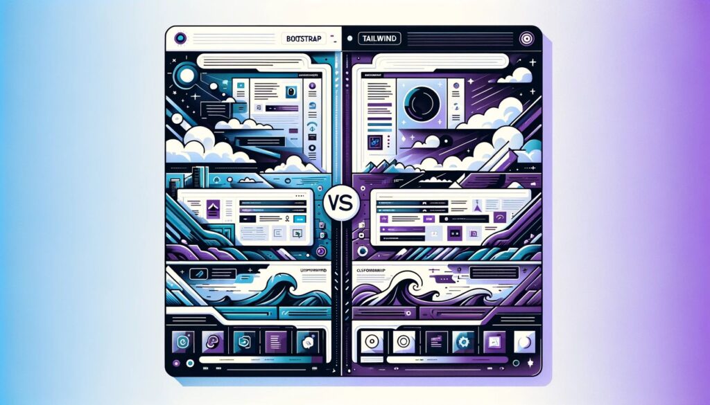
Analyzing the Differences in Design Approaches and Usability
Bootstrap’s component-based design offers a variety of pre-designed components like buttons, forms, and navbars, which are customizable but come with predefined styles. It’s ideal for beginners or projects requiring rapid prototyping, providing a consistent look and feel across projects. However, while customization is possible, extensive changes to the default styles can be complex.
In contrast, Tailwind CSS adopts a utility-first design. It provides low-level utility classes that offer developers the freedom to build custom designs within the framework’s constraints. This approach grants fine-grained control over styling but comes with a steeper learning curve, requiring familiarity with utility classes and naming conventions. Tailwind CSS is particularly effective for creating responsive designs with its mobile-first approach and responsive utility classes.
Case Studies: When to Use Bootstrap vs. Tailwind
Bootstrap is best suited for projects that need quick turnarounds and less concern for unique design elements. It’s favorable for teams with less CSS experience or those transitioning from traditional web development. Projects where UI/UX consistency is prioritized over unique design will benefit from Bootstrap.
On the other hand, Tailwind CSS is ideal for projects requiring highly customized, unique designs. Teams comfortable with modern web development and preferring a hands-on approach to styling will find Tailwind CSS beneficial. It’s perfect for situations where control over every design aspect is crucial.
A Comparative Table: Bootstrap vs. Tailwind CSS
The comparison between Bootstrap and Tailwind CSS reveals that while Bootstrap excels in providing a comprehensive set of pre-designed components for quick development, Tailwind CSS offers unparalleled control and customization for unique, tailor-made designs. Bootstrap’s gentle learning curve makes it accessible for rapid prototyping and development, especially for teams less experienced in CSS. In contrast, Tailwind CSS’s utility-first approach is ideal for custom projects, demanding a deeper understanding of styling but offering greater flexibility and creativity in design.
Other Notable CSS Frameworks
While Bootstrap and Tailwind CSS are prominent players in the CSS framework arena, the landscape is diverse with several other frameworks offering unique features and advantages. Exploring these alternatives can provide web developers with additional tools that might be more suited to specific project requirements or personal preferences.
Overview of Other Popular CSS Frameworks
- Foundation by ZURB: Known for its advanced responsiveness and flexibility, Foundation is a favorite among developers looking for a robust and professional framework. It’s particularly well-suited for complex web applications and websites requiring a high degree of customization.
- Bulma: Bulma stands out with its modern, minimalist approach. It’s a purely CSS-based framework (no JavaScript components), which makes it lightweight and easy to learn. Its syntax is readable and friendly, ideal for those who prefer a more straightforward, style-focused approach.
- Semantic UI: As the name suggests, Semantic UI focuses on human-friendly HTML. It provides a semantic approach to web design, making the code more intuitive and maintainable. It’s also highly themable, offering a range of customization options.
- Materialize: Inspired by Google’s Material Design, Materialize provides a set of design standards and components that mirror the Material Design guidelines. It’s great for developers looking to implement material design principles in their web projects with ease.
- Skeleton: Skeleton is a lightweight and simple CSS framework, perfect for smaller projects or when a full-scale framework like Bootstrap is unnecessary. It provides basic styling for common HTML elements and a responsive grid, making it ideal for quick prototypes or minimal websites.
How to Choose the Right Framework for Your Project
Choosing the right CSS framework depends on several factors:
- Project Complexity: For complex, large-scale applications, frameworks like Foundation or Bootstrap offer extensive components and customization options. For simpler projects, Skeleton or Bulma might be more appropriate.
- Design Philosophy: If a utility-first approach aligns with your development style, Tailwind CSS is a great choice. For a more traditional, component-based approach, Bootstrap or Foundation are suitable.
- Learning Curve: Consider the team’s familiarity with the framework. Frameworks like Bulma and Skeleton have gentler learning curves, while Foundation and Semantic UI might require more time to master.
- Customization Needs: For projects requiring specific design aesthetics, Materialize or Semantic UI provide thematic elements that align with certain design principles.
Diversifying Your CSS Framework Knowledge
Understanding the strengths and capabilities of various CSS frameworks is invaluable for web developers. Each framework has its philosophy and set of tools, offering different approaches to web design and development. Experimenting with these frameworks not only broadens a developer’s skill set but also provides more tools to tackle a wide range of web development challenges effectively.
Best Practices for Using CSS Frameworks
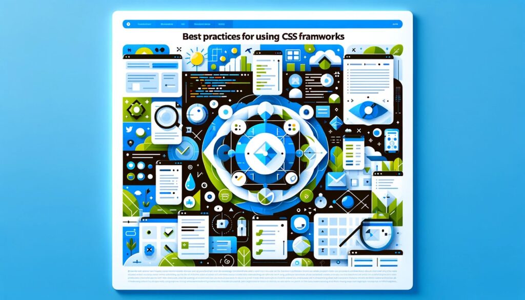
Effectively integrating CSS frameworks into web design requires adherence to certain best practices. These guidelines not only enhance the development process but also ensure that the final product is optimized, maintainable, and scalable.
Guidelines for Effective Integration of CSS Frameworks
- Understand the Framework’s Core Principles: Before diving into coding, spend time understanding the chosen framework’s philosophy, components, and classes. This foundational knowledge helps in utilizing the framework to its fullest potential.
- Start with a Plan: Outline the structure of your project before starting. Determine which components you’ll need and how the framework can best serve your design goals. Planning ahead saves time and resources in the long run.
- Keep It Simple: Avoid overusing the framework’s components and utilities. Overcomplication can lead to bloated code and diminish the performance and readability of your website. Strive for simplicity and clarity.
- Customize Thoughtfully: While customization is a powerful feature of most frameworks, it should be done judiciously. Over-customizing can negate the benefits of using a framework, such as consistency and maintainability.
- Stay Updated with Framework Versions: Frameworks are regularly updated with new features, bug fixes, and security patches. Keeping your framework version up to date is crucial for the security and efficiency of your project.
- Test Across Browsers and Devices: Regularly test your project on different browsers and devices to ensure compatibility and responsiveness. This practice helps in identifying and fixing layout issues or inconsistencies early in the development process.
- Optimize for Performance: Monitor the impact of the framework on your website’s performance. Utilize tools to minimize CSS and JavaScript files and leverage the framework’s features that contribute to better performance.
- Document Customizations: Keep a record of any customizations or additions you make to the framework. Good documentation is essential for future maintenance and updates.
Avoiding Common Pitfalls
- Overreliance on Frameworks: Relying too heavily on a framework can limit creativity and lead to generic designs. Use frameworks as a tool to aid development, not as the sole driver of your project’s design.
- Neglecting Semantic HTML: Ensure that your HTML remains semantic and accessible. Frameworks should enhance, not replace, good HTML practices.
- Ignoring Mobile-First Principles: In an increasingly mobile-centric world, designing with a mobile-first approach is critical. Most frameworks are equipped with tools to facilitate this, but it’s up to the developer to implement them effectively.
Enhancing Performance with CSS Frameworks
Performance is a key consideration in web development. CSS frameworks, when used correctly, can significantly improve the performance of a website. Leveraging their built-in optimization features, such as responsive image classes and lazy loading utilities, can enhance loading times and overall user experience.
Conclusion
CSS frameworks like Bootstrap, Tailwind CSS, and others have revolutionized web development, offering tools for efficiency, consistency, and responsive design. This guide has underscored the importance of choosing the right framework, understanding its principles, and following best practices.
In a rapidly evolving digital landscape, staying updated with the latest trends and framework updates is crucial for any web developer. These frameworks are not just tools for simplification but gateways to enhanced creativity and skill in web design. Whether you’re a beginner or an expert, embracing these frameworks can significantly elevate the quality of your web projects. As the field of web development continues to advance, each new project offers a unique opportunity to learn, adapt, and grow.