This tutorial covers the creation of a DataList control to retrieve records from a database. Also shows you how to make the DataList esthetic by changing its attributes.
DataLists are usually used to display values stored in a database. On the HTML part it actually uses tables with rows and columns to display values.
Start a new ASP .NET Web Application project in Visual Studio .NET.
Now that you are in the Design mode of WebForm1.aspx, drag a DataList control from the Toolbox. DataList1 shows up:
First, let’s take care of the HTML part of our web application. Go to the HTML source and inside the main form (Form1) you’ll see the code for the DataList:
<asp:DataList id="DataList1" style="Z-INDEX: 101; LEFT: 16px; POSITION: absolute; TOP: 16px" runat="server"></asp:DataList>Here we’re going to control how the results from the database will be displayed in the DataList. We are going to do this by using ItemTemplate, which controls the formatting of the items:
<asp:DataList id="DataList1" style="Z-INDEX: 101; LEFT: 16px; POSITION: absolute; TOP: 16px" runat="server">

   <ItemTemplate>

   <%# DataBinder.Eval(Container.DataItem, "Title")%>

   <%# DataBinder.Eval(Container.DataItem, "URL")%>

   </ItemTemplate>

</asp:DataList>
Title and URL are the name of the columns in the database. In this tutorial I’m using the MyDB database created in the tutorial named ‘Connecting to a SQL database from ASP .NET I‘ and accessed in the tutorial named ‘Connecting to a SQL database from ASP .NET II‘.
For now let’s leave the HTML source like this and let’s code the C# part from the file WebForm1.aspx.cs.
Inside this file I believe you already established a connection to the database from which we’re going to retrieve the values.
If not here’s the code I used:
Inside the public class named WebForm1:
// This one was already created when you added the DataList

protected System.Web.UI.WebControls.DataList DataList1;

// Here's what we need to establish the connection

protected System.Data.SqlClient.SqlConnection sqlConnection1;

protected System.Data.SqlClient.SqlCommand sqlSelectCommand1;

protected System.Data.SqlClient.SqlDataReader sqlDataReader1;
Inside InitializeComponent() – after you expand the region:
this.sqlSelectCommand1 = new System.Data.SqlClient.SqlCommand();

this.sqlConnection1 = new System.Data.SqlClient.SqlConnection();

this.sqlSelectCommand1.CommandText = "SELECT * FROM dbo.MyLinks";

this.sqlSelectCommand1.Connection = this.sqlConnection1;

this.sqlConnection1.ConnectionString = "workstation id=WORKSTATION;packet size=4096;user id=aspnet;data source=WORKSTATION;persist security info=True;initial catalog=MyDB;password=secret";

// This line was already there

this.Load += new System.EventHandler(this.Page_Load);
It’s time to do some binding. Replace the Page_Load method with this one, that contains the code needed:
private void Page_Load(object sender, System.EventArgs e)

{

   // Open the connection to the database

   sqlConnection1.Open();

   // Use the DataReader with the Select command

   sqlDataReader1 = sqlSelectCommand1.ExecuteReader();

   // Set the DataSource for DataList1 back in the HTML...

   DataList1.DataSource = sqlDataReader1;

   // ...and bind

   DataList1.DataBind();

   // Close the data reader...

   sqlDataReader1.Close();

   // ...and the connection to the database

   sqlConnection1.Close();

}
It’s fully commented so I doubt you will have any problems understanding it.
Compile now and watch the result in the browser’s window:
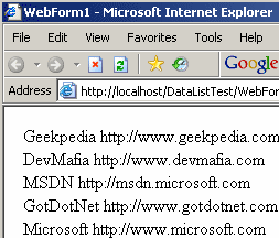
In the screenshot you can see the results from the MyDB database – MyLinks table.
The remaining part of this tutorial deals with DataList templates.
For this we need to go back to the HTML source of WebForm1.aspx. Here we will make some changes.
Dividing into columns
An interesting feature of DataLists is that it can divide the items into columns. By adding two attributes to the asp:DataList you can obtain the result:
<asp:DataList id="DataList1" style="Z-INDEX: 101; LEFT: 16px; POSITION: absolute; TOP: 16px" runat="server" RepeatColumns="2" RepeatDirection="Horizontal">
<ItemTemplate>
<%# DataBinder.Eval(Container.DataItem, "Title")%>
<%# DataBinder.Eval(Container.DataItem, "URL")%>
</ItemTemplate>
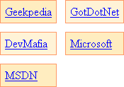
</asp:DataList>And here’s the result:

Now change the RepeatDirection attribute to Vertical. Here’s the result, notice the difference:

Different order is the difference. Horizontal display the items from left to right and when the columns are finished, another row starts. Vertical acts different. First it fills an entire column, then skips to another row.
CellSpacing
This is what we need to add to our DataList, as the items are too close to each other. We can do this simply by using the CellSpacing attribute, just as we would do with a Table
tag:
<asp:DataList id="DataList1" style="Z-INDEX: 101; LEFT: 16px; POSITION: absolute; TOP: 16px" runat="server" RepeatColumns="2" RepeatDirection="Horizontal" CellSpacing="12">

   <ItemTemplate>

   <%# DataBinder.Eval(Container.DataItem, "Title")%>

   <%# DataBinder.Eval(Container.DataItem, "URL")%>

   </ItemTemplate>

</asp:DataList>
Much better, don’t you think?
Give some (background) color
Setting the attribute ItemStyle-BackColor we can give a background color to the items:
<asp:DataList id="DataList1" style="Z-INDEX: 101; LEFT: 16px; POSITION: absolute; TOP: 16px" runat="server" RepeatColumns="2" RepeatDirection="Horizontal" CellSpacing="12" ItemStyle-BackColor="#ffedc0">

   <ItemTemplate>

   <%# DataBinder.Eval(Container.DataItem, "Title")%>

   <%# DataBinder.Eval(Container.DataItem, "URL")%>

   </ItemTemplate>

</asp:DataList>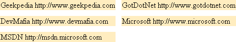
Still, we have much more to change to make it esthetic.
Alternating row colors
This procedure is well known as it makes easier to view several rows close to each other. In other programming languages you had to code this manually. Now you can easily do this by setting an attribute:
<asp:DataList id="DataList1" style="Z-INDEX: 101; LEFT: 16px; POSITION: absolute; TOP: 16px" runat="server" RepeatColumns="2" RepeatDirection="Horizontal" CellSpacing="12" ItemStyle-BackColor="#ffedc0" AlternatingItemStyle-BackColor="#fff3d7">
<ItemTemplate>
<%# DataBinder.Eval(Container.DataItem, "Title")%>
<%# DataBinder.Eval(Container.DataItem, "URL")%>
</ItemTemplate>
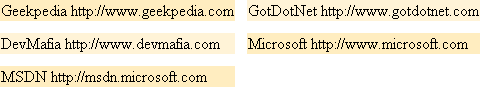
</asp:DataList>And the result shows that it works:
Cellpadding
Like in tables, you can change the padding of the cells for a DataList control:
<asp:DataList id="DataList1" style="Z-INDEX: 101; LEFT: 16px; POSITION: absolute; TOP: 16px" runat="server" RepeatColumns="2" RepeatDirection="Horizontal" CellSpacing="12" ItemStyle-BackColor="#ffedc0" AlternatingItemStyle-BackColor="#fff3d7" CellPadding="6">

   <ItemTemplate>

   <%# DataBinder.Eval(Container.DataItem, "Title")%>

   <%# DataBinder.Eval(Container.DataItem, "URL")%>

   </ItemTemplate>

</asp:DataList>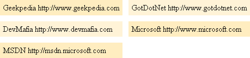
That’s more like it! But if there would be a thin border…
Borders
Similar to setting a border for a table, we set a border of DataList‘s
items:
<asp:DataList id="DataList1" style="Z-INDEX: 101; LEFT: 16px; POSITION: absolute; TOP: 16px" runat="server" RepeatColumns="2" RepeatDirection="Horizontal" CellSpacing="12" ItemStyle-BackColor="#ffedc0" AlternatingItemStyle-BackColor="#fff3d7" CellPadding="6" ItemStyle-BorderWidth="1" ItemStyle-BorderColor="#ff9966">

   <ItemTemplate>

   <%# DataBinder.Eval(Container.DataItem, "Title")%>

   <%# DataBinder.Eval(Container.DataItem, "URL")%>

   </ItemTemplate>

</asp:DataList>
Now it looks more esthetic. There’s only one thing left to do. Change the text. Actually we could make links from this results that point to the URLs stored in the database. And we’re going to do this.
Making links
<asp:DataList id="DataList1" style="Z-INDEX: 101; LEFT: 16px; POSITION: absolute; TOP: 16px" runat="server" RepeatColumns="2" RepeatDirection="Horizontal" CellSpacing="12" ItemStyle-BackColor="#ffedc0" AlternatingItemStyle-BackColor="#fff3d7" CellPadding="6" ItemStyle-BorderWidth="1" ItemStyle-BorderColor="#ff9966">

   <ItemTemplate>

      <asp:HyperLink NavigateUrl='<%# DataBinder.Eval(Container.DataItem, "URL")%>' Runat="server">

      <%# DataBinder.Eval(Container.DataItem, "Title")%>

      </asp:HyperLink>

   </ItemTemplate>

</asp:DataList>
I think you can see what we have done here. We create a new hyperlink with the text provided by the Title column from the database, and with the NavigateUrl attribute set to the current value from the URL column.
Finally, this is the result:
If you look at the HTML source of the web page when it is run, you can see that the DataList and all it’s items and attributes are replaced by a HTML table with rows and columns.
Update – tutorial continuation
There’s more to say about the DataList control, that’s why I updated the tutorial.
For example I never mentioned about the Templates. They represent an important element to customizing the layout of the DataList control. Templates are not only used with this control, after you see here how they are used, you’ll be able to apply templates to other similar controls, like the DataGrid.
Item, header, footer, separator, selected, edit and alternating are elements of the template. We’ve already used item and alternating, now we’re going to use the rest.
HeaderTemplate
The HeaderTemplate, as you might expect, appears above the items in the control.
<asp:DataList id="DataList1" style="Z-INDEX: 101; LEFT: 16px; POSITION: absolute; TOP: 16px" runat="server" RepeatColumns="2" RepeatDirection="Horizontal" CellSpacing="12" ItemStyle-BackColor="#ffedc0" AlternatingItemStyle-BackColor="#fff3d7" CellPadding="6" ItemStyle-BorderWidth="1" ItemStyle-BorderColor="#ff9966">

   <HeaderStyle Font-Bold=True ForeColor="#000099" />

      <HeaderTemplate>

      Results from the MyLinks table

      </HeaderTemplate>

   <ItemTemplate>

      <asp:HyperLink NavigateUrl='<%# DataBinder.Eval(Container.DataItem, "URL")%>' Runat="server">

      <%# DataBinder.Eval(Container.DataItem, "Title")%>

      </asp:HyperLink>

   </ItemTemplate>

</asp:DataList>
In this example not only that we use the HeaderTemplate item to add a header to our DataList, we also use HeaderStyle, which defines the style that shall be applied to the content of the HeaderTemplate tag. In this example it makes the font bold, and navy blue. The result is this:
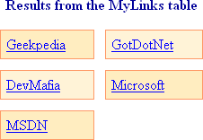
We could have also used HTML tags inside the Header, but if you look at the (final) HTML code you’ll see that using the HeaderStyle tag the code will be this:
<td colspan="2" style="color:#000099;font-weight:bold;">

Results from the MyLinks table

</td>
CSS styles are used, if instead you directly used tags inside HeaderTemplate, they wouldn’t be transformed into CSS styles.
As a side note, instead of using the <HeaderStyle /> tag, you could also specify the style for the header of the DataList by using attributes inside the <asp:DataList> tag.
FooterTemplate
Similar to HeaderTemplate, only that it appears below the items. It’s clear that there’s also a FooterStyle for it that does the same thing as HeaderStyle.
Here’s how I used it:
<asp:DataList id="DataList1" style="Z-INDEX: 101; LEFT: 16px; POSITION: absolute; TOP: 16px" runat="server" RepeatColumns="2" RepeatDirection="Horizontal" CellSpacing="12" ItemStyle-BackColor="#ffedc0" AlternatingItemStyle-BackColor="#fff3d7" CellPadding="6" ItemStyle-BorderWidth="1" ItemStyle-BorderColor="#ff9966">
<HeaderStyle Font-Bold=True ForeColor="#000099" />
<FooterStyle Font-Size="11px" ForeColor="DimGray" />
<HeaderTemplate>
Results from the MyLinks table
</HeaderTemplate>
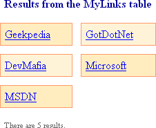
<FooterTemplate>
There are <%# DataList1.Items.Count.ToString()%> results.
</FooterTemplate>
<ItemTemplate>
<asp:HyperLink NavigateUrl='<%# DataBinder.Eval(Container.DataItem, "URL")%>' Runat="server">
<%# DataBinder.Eval(Container.DataItem, "Title")%>
</asp:HyperLink>
</ItemTemplate>
</asp:DataList>It displays the number of items indside the DataList. Here’s a screenshot:
SeparatorTemplate
The SeparatorTemplate appears between the rows of the DataList. I don’t think you need any example for this one. You usually want this element for inserting <hr /> tags (horizontal rule) between the rows.
SelectedItemTemplate
The content of the SelectedItemTemplate element is displayed when the an item from the control is selected. I’m not going to give you an example on this, as we must change most of the code, as it doesn’t work with all types of controls, but I can’t point you to an MSDN resource: SelectedItemTemplate Property.
EditItemTemplate
Similar to the SelectedItemTemplate, this one doesn’t work will all types of controls, as it occurs when an item from the DataList is in Edit mode. So I’m going to give an MSDN reference: EditItemTemplate Property.